Complete analytics dashboard interface
Metric Pulse opens as a complete analytics dashboard interface with KPIs, trend cards, operational status, comparison points, and performance summaries already in place.
Metric Pulse opens as a complete analytics dashboard interface with KPIs, trend cards, operational status, comparison points, and performance summaries already in place.
The example is organized to help a team understand current performance and decide where to focus next, so first changes can improve the real user journey instead of rebuilding from nothing.
Use DriftLess to change metric names, team context, trend logic, dashboard density, and operating cadence while preserving the polished starting point and live preview behavior.
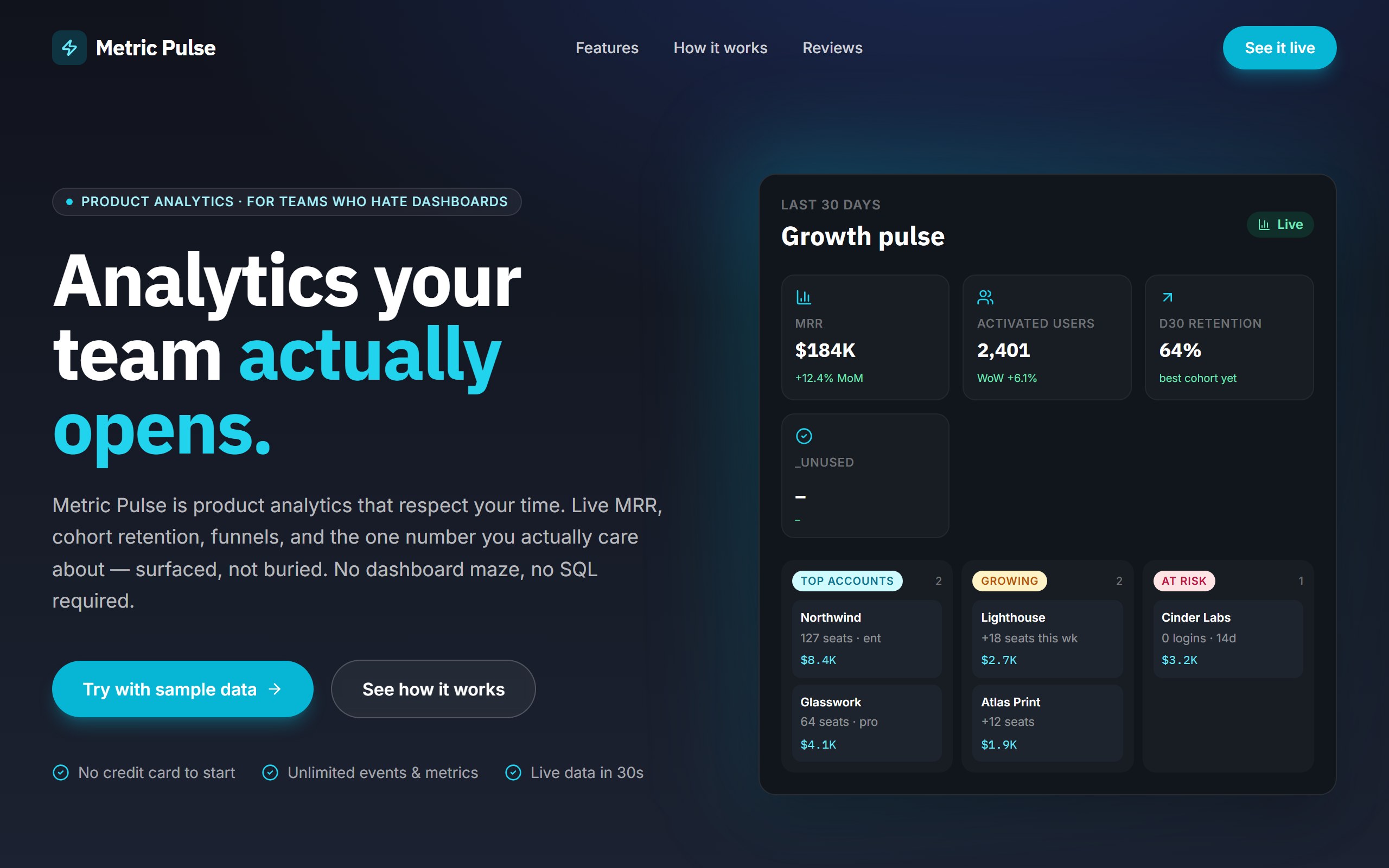
Metric Pulse is a curated DriftLess example for a analytics dashboard interface. Product-analytics landing. Dark slate + cyan, IBM Plex display, hero with mock growth-pulse dashboard (KPIs + top accounts grid).
When you click Use template, DriftLess creates a new project from this example and opens the unchanged preview first. Your next request can change metric names, team context, trend logic, dashboard density, and operating cadence without starting over.
Starting idea
Product-analytics landing — slate + cyan, mock dashboard with KPIs and a 3-column "top accounts / growing / at risk" grid. Out of scope: real auth, real event ingestion. Mock illustrative only.
Retarget the cards to MRR, activation, churn, pipeline, support, or product metrics.
Shift the dashboard toward incidents, backlog, capacity, risks, and weekly priorities.
Change metrics and sections to campaigns, channels, conversion, and spend.
Start from Metric Pulse and inspect the unchanged live preview.
Review the main analytics dashboard interface sections: KPIs, trend cards, operational status, comparison points, and performance summaries.
Ask DriftLess for a focused first change around metric names, team context, trend logic, dashboard density, and operating cadence.
Use the suggested first-change chips when you want a fast starting point.
Run a final polish pass for mobile spacing, visible hierarchy, and the primary conversion or workflow action.
Use template creates a new project from this example.
The preview opens first, so you can inspect the starting point before spending credits on changes.
Tell DriftLess what to change in plain English: products, colors, sections, wording, pages, or workflow.
Progress, preview updates, files, and recovery actions stay visible while the draft improves.
Suggested first changes
Brain planned architecture
Writer generated dashboard
Guardian flagged 5 issues
Reviewer drove 5 review rounds